
Our first poster this go-round is from Premiere Wrestling Xperience. Unfortunately this event wound up being cancelled (from what I saw there were concerns about the venue and its location), but despite that the poster is certainly top notch. I love the color scheme, the graphics are beautiful, and the stock photos of the talent featured make them all look like superstars. Since I started this series, PWX posters have been the precedent for which all others have been compared and so long as they're publishing material as good as this they will continue to be.

Up next is an offering from Champions With Attitude Pro Wrestling, a company that will celebrate a decade of running shows at the event promoted on the poster below. Not many indie wrestling promotions make it past year 2 much less year 10, so the fact that CWA has been around for as long as it has is a real testament to the folks working behind the scenes there.
Champions With Attitude has long been known for production value as their events feature staging, lights, custom entrance videos, and other elements that you just don't see on the independents. Their posters fall into that category as well as they are always vivid pieces that deliver information while being eye-catching. The only problem I have with CWA's posters is that they could be described as repetitive. The layout you see here is what they seem to use month to month, the only variation being the talent featured. Even so, theirs are still better than 98% of what's out there.

If you've been following this blog series and some of the other content I produce (Rasslin' with Redbeard, specifically), you'll know that I frequent WrestleForce shows because I enjoy them very much. I would go so far as to say that if they're not the best promotion in South Carolina they're at least in the top 2. With that in mind, this poster for their "FULL THROTTLE" event coming up in September is by far the best they've produced in quite some time. It would be gosh-darn near perfect if not for two things.
1) Lack of any discernible logo - no, "WrestleForce presents" is not a logo. This goes along with what I've preached before about branding, marketing, and how it's important to establish an identity.
2) The stock photos look great, but I take umbrage with the fact that Cedric Alexander (middle-right) isn't at the forefront of the featured wrestlers. Why? He's the current WrestleForce champion, that's why - John Skyler's talented, don't get me wrong, but if he's not the champ he shouldn't get top billing over the man who is.

Speaking of brand identity issues, I hate to say this but I have no idea what company the following poster is for - all I know is that there was apparently an event called Summer Smackdown 2. It bothers me that a group could put together a poster with graphics like those but then not try and establish themselves with a logo or even a name. That's just odd, quite frankly. There's a guy with a belt (albeit a replica belt): What belt is that? What division does he command? Or did he just wander in with it when photos were being taken and insist he be able to hold it?
Also, there are 16 members of the roster featured on this poster, 17 if you count the fellow with a question mark where his face should be. That's about 10 too many in my opinion as they could have certainly gotten by in making the event appear desirable by way of presenting a core group of attractive athletes.

Anarchy Wrestling in Cornelia, GA has seen more than a few stars come through the confines of their arena over the years. (If you didn't know, Anarchy Wrestling began as NWA Wildside and later transformed into NWA Anarchy before eventually settling as Anarchy Wrestling.) They are one of the most successful promotions in the southeast and yet their posters have consistently gotten on my nerves because of the fact that they are usually overcrowded with talent. Such is the case with this poster for their "HOSTILE ENVIRONMENT" event. For the life of me, I do not see the point in trying to get your entire roster on the poster. Draw people in with 6-8 of your best looking talent, men and women that will sell people on your event and make them want to pay money to be there.
Of course I say that then I have no choice but to refer back to my comment about the success of Anarchy Wrestling over the years. A great poster helps but it's icing on the cake if people already know they're going to have a great time at a show because of past experiences.

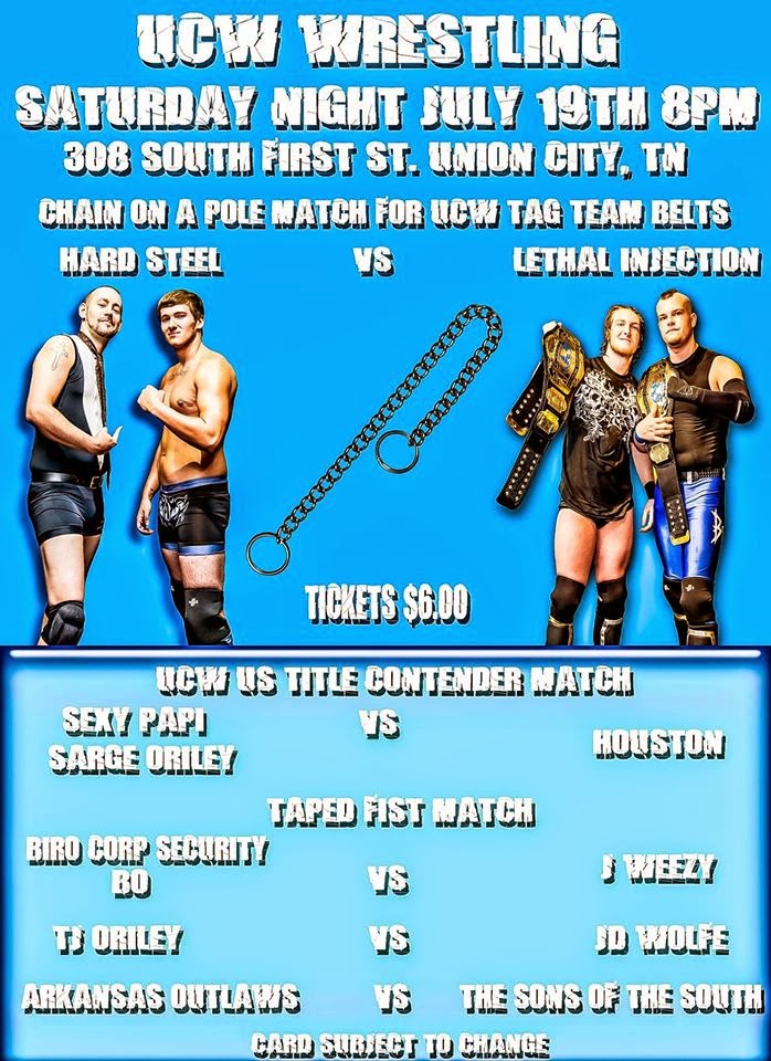
Ultimate Combat Wrestling in Union City, TN isn't a promotion that I've ever had the chance to see in person. Be that as it may, judging by this recent poster, I'm going to hazard a guess that they are a company with means and ideas but that may need a little bit of a boost to get them onto the next rung. This poster is of the sort that screams to me "I want to make something more interesting, I just don't have the tools to get what's in my brain onto paper". The stock photos look good. The information fans need is all there. The fonts and letter spacing could be better but I would much sooner look at a poster like this that's clean and minimal in what it's doing than something that's bloated with unnecessary material.
As the final example of a "tweener" for this entry, I present to you a recent poster published by Southern Wrestling Association operating out of Forest City, NC. For starters, I have no idea what's going on in the background. I'm guessing here but I think it's a trio of images from horror films (the top third looks like it could be from Let the Right One In/Let Me In, and the bottom third might be something from The Ring, and the middle could be anything). The title of the event is "HALLOWED GROUNDS", but even so the horror film imagery doesn't make sense - all it does is create a muddy palette. The talent stock photos are mostly suspect and they're much too small to be effective at selling the athletes as being the reason why a fan would want to come to the show. (Again, when making a poster you have to sell the talent; graphics and fonts are great but people aren't paying to see your juiced up copy of Photoshop, they're paying to see wrestling.) This isn't a good poster by any means but it's not awful either. With some edits it could actually be a solid piece of work but as it is it's mostly displeasing to look at and, to me, it doesn't do a good job of making me want to come to the event.
You may have noticed that this image is actually a photo someone took of the poster. For the record, I don't think I've never seen a pure digital copy of an SWA poster. Needless to say, that is rather odd.

Have you ever encountered something that you want to dislike but can't for whatever reason? Pickled ginger comes to mind; it tastes like Pine-Sol smells yet I enjoy it immensely! As another example of that, I give you the following item from Milestone Wrestling's July 2014 event. A poster that has so much patriotism and American pride going on that it's a Ronald Regan reference away from being perfect - perfectly insane, that is. The artist must be a fan of westerns because he stuck John Wayne in there. Was John Wayne a fan of professional wrestling? Could you imagine John Wayne in a wrestling match, especially in one against any of the guys on this poster? He'd probably whip the lot of them all at once then say something like "You boys rassle about as well as a one-legged horse trots...How 'bout you do yourselves a favor and learn from that critter by staying on the ground."

I know I harp a lot about stock photos and the importance of having good ones. I persist that if you're going to be in this line of work you've got to do your best to make the talent look desirable, and you can't do that with stock photos of your roster that look like images printed from a cell phone photo on an inkjet printer then scanned on low resolution settings. Even as a stylistic choice where filters could be used to create certain looks it's still a bad idea to me to do something to make your talent - who are hopefully guys & girls who look like athletes - come off poorly. In that regard, take a look at what South Carolina Wrestling has done for their "STILL STANDING" event. The graphics aren't bad but here again they're there for the purpose of accentuating the talent. Do any of those guys look like wrestlers you would pay money to see perform? If the answer is no, then I'm afraid I've got some bad news (get well soon, Wade)!

The poster below from Southeastern Pro Wrestling in Double Springs, AL is an awful wrestling poster because it, like seemingly so many others I've torn to shreds in this entry, has way more text on it than it does vivid imagery of professional wrestlers. I don't know how many more different ways I'll be able to say the same thing - it makes no sense to me that the folks who design these things don't consider the fact that WRESTLERS are the reason why fans come to pro WRESTLING events. As a fan, I don't really care about "special challenge" matches. And for that matter, I don't think I've ever in my life seen a promotion point out what the "opening match" will be. It's as if to say, "Yes, the show starts at 8 PM but Douche Haven and Chris McCantwrestle are on first so you've got til 8:20!"
Perhaps more offensive than the poster itself is the fact that SEPW is using a replica of the World Wrestling Entertainment intercontinental title as their intercontinental title as well as replicas of the World Championship Wrestling tag team titles as their tag team titles. Nevermind the fact that an indie company having an intercontinental title is silly to begin with. Does no one know the etymology of the word "intercontinental"? Does anyone know what etymology is, for that matter?

I must preface my comments about this next poster with the fact that I did, in fact, attend the event it promotes. It was a fun show with some great talent from the region featured on the card. (It was a bit bizarre in the fact that Gangrel - a vampire - and Dr. Creo - a voodoo practitioner - who work together as the tag team "The Sons of Midnight" were fan favorites. Seriously, children were cheering for a guy with fangs & blood dripping from his mouth and a guy who brings a smoking skull to the ring.) Plus, any reason to go to Charleston, SC is a good reason because Charleston is awesome regardless. Niceties out of the way, Old School Championship Wrestling needs a lot of help when it comes to their posters. I've followed them for years and I can tell you that this is more or less what you get with their promotional materials - weird, solid colors for the background and stock photos that often make the wrestlers look dumpy and somewhat misshapen. OSCW has been around for a long time and they've never gotten better than this. It makes me think the hamster is asleep in the wheel, as in someone cares enough to keep it alive but doesn't care so much that they want it to be more than it is.

Southern Fried Championship Wrestling. Do I really need to say anything else? The guy in the upper-right looks like he doesn't eat anything unless it's dipped in batter and deep fried. And is it me or does has he have bits of processed cheese slices wrapped around his fist? As for the guy in the top-left, I can't decide if that's an obscene hand-gesture he's making or not. I'm leaning towards it is because his presentation of being half Jeff Hardy mark/half Juggalo is an obscenity in and of itself.

Operating out of the upstate of South Carolina in Gaffney, 3CW - which is short for Carolina Christian Championship Wrestling (that name is something of a mouthful) - has drawn my ire previously and I'm sad to say that matters have not improved since the last time I saw one of their posters. This looks like it was put together by an infant, or possibly a grown-up with an infantile sense of what a wrestling poster should look like. If it had been put together by an infant, I'd probably compliment the child on the fact that they could make this because their skills will hopefully continue to develop. Since that more than likely wasn't the case I'm just going to sit here and shake my head for a moment because I don't know how else to react to a wrestling promotion that bothers to add its referees to their posters.

Before I get into commentary on this next poster, I feel as though I should shed light on two acronyms that are present here. First, AIWF, which stands for Allied Independent Wrestling Federations. It's something of a facsimile of the National Wrestling Alliance in that member promotions share talent and there are championships sanctioned by the AIWF that may be defended at events falling under the AIWF banner. Second, EDGE Wrestling, short for Extremely Dangerous Grappling Entertainment. Sounds kind of like someone might have borrowed from GOUGE (Gimmicks Only Underground Grappling Entertainment) or even OMEGA (Organization of Modern Extreme Grappling Arts) on the name, but I digress.
As for the poster itself, your guess is as good as mine as to what's going on here. The talent featured on the poster appear to be guys who take their craft seriously as from their builds they do look like athletes. Even so, the photos are too small and so poor quality that I can't make out much about them. There appears to be a planetoid in the upper third of the poster, which may or may not be the moon, and to its immediate right there's a tiny graphic of the continents of planet Earth. There could be some message of world domination in there but you'd have a hard time convincing me of it. But hey, at least they have a logo!

I have to point out that I'm fairly depressed right now. Having written this post in mostly one sitting and thereby having forced myself to dwell on the subject matter herein for a fairly lengthy amount of time, I will tell you that my mind is in a place where I feel as though I could benefit from certain types of pharmacology. And grain alcohol. Do they make whiskey flavored anti-depressants? No? Darn.
In wrapping up this entry to my Sudden Proliferation of Bad Wrestling Posters series, I bring you this poster from C4W Xplosive Wrestling from Myrtle Beach, SC. From my perspective, this is an example of how to do everything wrong in regards to a pro wrestling poster.
The text at the top of the poster states that C4W is "Myrtle Beach's #1 professional wrestling attraction". I'm somewhat offended that they chose to refer to their product as an "attraction" because the term plays into the tourist vibe of that area and in so doing cheapens the product. Also, to my knowledge, they are the ONLY pro wrestling company operating in Myrtle Beach. Is there a point to telling people you're number one when there isn't a number two, three, four, five, etc.? The text goes on to tout their having been voted the "Best New Promotion in the Carolinas" in 2011. That's cute, but that was three years ago. What have you done since then?
I've preached about the importance of logos in terms of an emblem being a great way to market a brand. In contrast, I never thought I would have to preach moderation in regard to logos but here I am about to do exactly that. There are 5 logos on this poster - three that have to do with C4W, one for AIWF, and I'm counting "The Civil War" graphic as one as well. The asinine nature of the name "C4W Xplosive Wrestling" aside (I can only imagine the creative process in picking that name had something to do with the fact that it would allow for the usage of words like "xplosion" and "xplosive", because of course any word that starts with an X is edgy), why use three of your own logos? Did whoever designed this think people were going to get lost while viewing it and forget they were looking at a C4W poster? "What, where am I? OH, C4W...I like potatoes!"
Let me take a moment to criticize "The Civil War" logo. I don't want to come off as a person who's easily offended by this sort of thing but I feel like using the phrase "the civil war" in relation to something like promoting a wrestling event is absolutely classless and in horribly poor taste. As if we don't have enough reminders of that bloody, tragic era of American history still being flamboyantly displayed here in South Carolina, I can't think of any good reasoning why a company would choose that as the title for one of their events. Use some other reference to warfare if you really have to, but not that - especially not here.
If you look closely at the ribbon running behind "The Civil War" logo you can see that the dates 1992 and 2010 are on either side of it. Refer back to the text at the top of the poster; "2011's Best New Promotion in the Carolinas". Either that logo is a piece of stock clip art someone at C4W found and decided to use without thorough inspection or an attempt at modification, or someone's timeline doesn't make sense. Could be a little of both in this scenario, but I digress.
Finally, I cannot leave out from my criticism the most inane aspect of this entire poster. The text beginning with "Battle Lines" and down from there is printed in a font called Comic Sans. Comic Sans is a font that was originally created for use in speech bubbles for help assistants in programs like Microsoft Office. (Remember Clippy the paperclip? Comic Sans is his native tongue.) Because of its cartoony, somewhat goofy nature, these days it is widely regarded as a font that should be reserved for use only by people who are 10 years old and under. People who don't know any better, in other words. The reason for that is because it looks silly and unprofessional, "silly" and "unprofessional" being two things one should try to avoid at all costs in the realm of professional wrestling.

I'm tapping out from this entry - I've had enough for now, but trust me when I say there will be more to come in the future.
No comments:
Post a Comment