Showing posts with label Botchamania. Show all posts

Saturday, November 22, 2014

Event Report: Trans-South Wrestling presents "HARDCORE BOOGIE"

I recently had an opportunity to make a road trip to the upstate for Trans-South Wrestling's "HARDCORE BOOGIE" event. The name comes from the fact that TSW would be hosting appearances by a pair of members of the World Wrestling Entertainment Hall of Fame, those being "The Boogie Woogie Man" Jimmy Valiant and "The Hardcore Legend" Mick Foley.

For more information on Trans-South Wrestling, visit them on either Facebook or Twitter via these links:

Facebook.com/TransSouthWrestling
Twitter.com/WrestlingTSW

The opening contest of the evening would be between Jaxson James and The Stro who, as you may or may not recall, was at one point in time a member of World Championship Wrestling's roster where he performed as The Maestro. Stro, as he refers to himself on social media, is also going by the name Papa. I don't know where that came from or what it is supposed to represent, but he comes to the ring with what appears to be a branding iron. Again, I don't know what it is but that's the gimmick he's going with.

This was a simple match but that's not a bad thing! Jaxson James is one of the best young talents we have in this area and one of a select few out of that group who has a look that will help him earn a living at some point in his life doing this crazy wrestling thing.


Following that was this bout between Josh Powers and Kameron Kade. Both Powers and Kade are known to have consistently strong showings; Powers in particular has gotten a reputation of being a reliable, versatile performer. I can attest to his talents as I've seen him perform at least half a dozen times in the past year and I would say that while he may not have the aesthetic of a top notch wrestler he has the tools. If ever the two meet up he'll be one to watch even more closely.

What I wasn't really sure about here is that I thought only a short while ago Kameron Kade was a villain in TSW yet he received a hero's welcome as soon as he came out of the back. I guess pro wrestling fans always have had short memories when it comes to that sort of thing.


One of the real stars of the evening came to the ring after the Powers/Kade match, that being the hardcore legend himself Mick Foley!

Foley would spend a few minutes addressing the fans in attendance, during which he made sure to put over TSW as being a quality promotion with great wrestlers. Not long into his talk, he was rudely interrupted by George South and Alex Avgerinos. South was quick to deem himself a superior author to Foley, essentially say that George's book - Dad You Don't Work, You Wrestle - is in a class above any of Mick's publications. Of course this approach to criticizing a fellow writer's work didn't wind up going so well for George...

I have to say that this was one of the most entertaining segments of the entire show. The interaction between Foley, South, and Avgerinos was fantastic and it did a great job in setting the stage for the main event of the evening.


Professional wrestling promoters, generally speaking, want to make the main event match THE match that fans go home talking about. It should be what sells the show and what ultimately makes fans want to come back for the next event. Sometimes it doesn't work out that way and a match on the under-card winds up stealing the show. That's exactly what happened at "HARDCORE BOOGIE" as Chase "Cauliflower" Brown and "The Southern Savior" John Skyler went out and had themselves a real barn burner.

Skyler and Brown are fantastic talents; Brown being the more traditional, old school style of grappler and Skyler being the modern heel. You throw in the presence of Skyler's manager, "The" Tommy Thomas, and you've got what was the match of the night in my opinion.


Everyone knows the old saying "less is more". I'm theorizing here but in my mind that statement goes along with the mechanical concept of how machinery with more moving parts are more likely to break down, hence the ideal of simplistic design being paramount. If you take that line of thought to the world of professional wrestling, the more competitors you involve the more likely it is that the end result is going to be messy, for lack of a better word.

I say all that to say this: The idea of a 4-way elimination tag team match at this level coming off well is a 50-50 prospect at best. This match wasn't bad but there's a lot going on here and not very much of it makes sense. It was an over-booked bout in my opinion; I'd have much sooner seen Chemical Z (Jett Black & TK Stark) have a rematch against Eric Adamz and Hardcore Hunter coming off TSW's last show where Adamz & Hunter brutally attacked Chemical Z in a post-match beat down.


With that, it was main event time!

We learned during Mick Foley's segment that what started off as an ordinary wrestling match would instead metamorphose into a "submit or surrender" match. "What's a submit or surrender match?", you ask. Good question because I was a little fuzzy on what it involved myself. Essentially it's a scenario where the only way to win is to either make your opponent submit or have them give up the contest in some way, shape, or form.

Alex Avgerinos has evolved into a real villain for TSW, which baffles me in a way. I still remember the days of pro wrestling's past when a good looking young man such as him would never be thought of as having an immoral cell in his body. He's a clean-cut gentleman, he wouldn't think of doing something as dastardly as throwing a ball of fire into the face of a fellow wrestler - which is exactly what he did to reigning TSW heavyweight champion Deon Johnson at the promotion's previous event!

There was a bit of heavy foreshadowing here as Deon Johnson came to the ring with Dirty, his tag team partner and one-half of the TSW tag team champions, who happened to be carrying a white towel with him. Alex Avgerinos, on the other hand, came to the ring by himself - no George South, so I assume the mandible claw Foley gave him earlier in the show was so debilitating that he couldn't accompany his charge. Wrestling is a rigorous activity but rarely do you see someone stop during a match to towel off because of excessive perspiration. The fact that Dirty had that towel meant something, clearly.

The finish of the match came off as being convoluted, I hate to say. Much like with the 4-way tag team match, there was a lot going on here at the end and if you weren't looking in the right spot you'd likely miss what happened to lead to the conclusion of the contest.


Overall this was a fun show with a good mix of talent and a variety of styles on display. There were some portions that could've been handled a little better, creatively speaking, and there were a handful of situations that didn't come off all that well, but that's nothing uncommon when it comes to indie pro wrestling so I'm not going to harp on that in these confines. The footage is here for you to make up your own minds!

Of course, it would have been out of character for me to have attended this event without filming an edition of my YouTube show, Rasslin' with Redbeard, during the show. You can view episode 11 of the program below, and if you enjoy it please keep in contact with me by either subscribing to my YouTube channel or liking the Rasslin' with Redbeard Facebook page!


TSW's next event will be Friday, December 5 in Laurens, SC where WWE and college football hall of famer Ron "Farooq" Simmons will be on hand for a meet & greet with fans.

Wednesday, October 8, 2014

The Sudden Proliferation of Bad Wrestling Posters - Part 4

It's been a few weeks since I published another entry in my "Sudden Proliferation of Bad Wrestling Posters" series - I hope that you, my dear readers, didn't think I'd run out of material. Never fear! So long as there are trailer park inhabitants with dreams of being pro wrestlers and people with questionable Photoshop skills (I say Photoshop even though some of these things look like they were put together in Microsoft Paint), there will always be bad wrestling posters.

We start off this entry with a real beauty from OMEGA Championship Wrestling which was used to promote their recent LOCO IN JOCO 2 event. Something I don't feel as though I've touched on in talking about exemplary posters in the past is the concept of form or how the layout of a poster makes the eye flow from one aspect of it to another. In the case of this poster, the LOCO IN JOCO logo (Say that 10 times fast!) creates a natural center point and the talent form a ring around it. Because of this, your eye naturally floats around the perimeter and you get to appreciate the quality each stock photo of the talent appearing on the show.

I was not at this event put I've seen photos and video from it and it was a literal standing-room-only affair. I have no doubt that these posters being seen in the local area played at least a part in that success!


Premiere Wrestling Xperience is consistently at the top of each of these entries, and there's a reason for that. I don't know if they have a dedicated art department or what but their posters are indicative of their having someone behind the scenes who's remarkably talented. This poster represents their DAWN OF A NEW DAY event. The only possible criticism I could make for this poster, and it would be reaching for something just to rake them over the coals about, is that they possibly could have incorporated a background that played into the idea of the "dawn" aspect of the event title. Like I said, that's me nitpicking for the sake of nitpicking - it's a fantastic poster regardless.


Flatline Pro Wrestling is an up & coming promotion operating not far from Augusta, Georgia that has gotten a lot of attention here lately and for all the right reasons. Their shows feature young, athletic, entertaining talent and their promoter seems to be doing a fine job of using every mechanism possible to get the word out about their events, which is a recipe for success. (Truly, it's amazing what can happen when wrestlers wrestle and promoters promote - people say the business is down, I say it's only down for promoters who aren't working hard enough.) There's a lot going on in this poster, which was used to advertise their REDEMPTION event, and it's a bit text-heavy but I have to say that I love what they're doing.

The talent stock photos are fantastic - clearly someone there gets what I've been saying about having crisp, clear images of the roster available for use in promotional materials. In this regard, I want to point out the center of the poster where two matches are detailed because this area is my favorite aspect of the whole thing. If you look there, what does it remind you of? From my perspective, it looks just like the versus loading screens from older fighting video games like Mortal Kombat and Street Fighter! I dig that and while I know they aren't the first to borrow the idea I think they've done it well enough to warrant taking note of it.


I don't recall that I've ever previously featured a poster from Shockwave Wrestling Entertainment in this series. They are one of several promotions (including Ring Wars Carolina and Steve Corino's Premiere Wrestling Federation) that seem to have popped up here lately in eastern North Carolina. North Carolina has never been lacking when it comes to professional wrestling, needless to say, but quantity doesn't necessarily equate with quality. That said, I feel as though this poster doesn't exactly deliver any incentives in the "I'm a wrestling fan but I've never seen these guys before" department. What I mean by that is, with the exception of Steve Corino, if I see this combination of talent on a poster I can't say that I'm going to become interested in attending the event. I see a lot of guys wearing shirts and two women who wouldn't make me turn my head if I saw them walking around in public. Harsh as though that may sound, this is a business where looks and physique matter almost more than anything else. The washed out, "antiqued" look doesn't help matters as it makes me feel as though it's there to try and hide flaws as opposed to compliment anything. As an admitted hard-to-please fan of professional wrestling, if all I ever see of SWE is this poster, unfortunately I won't have been convinced that the show is worth checking out.


I can't help but feel as though Southern Wrestling Association out of Forest City, North Carolina gets poorly represented by their posters. I genuinely hate to say that because I see photos and video from their events all the time, and hardly ever do I come away from absorbing that content feeling as though their shows aren't worthwhile. Quite the opposite, honestly - if not for the fact that it would be a 3+ hour drive for me, I'd probably attend their events. Be that as it may, this poster is what it is, which is to say more of the same from their "art department". I have no idea why you would select a photo of paint flaking off some random surface as a background image. Why? It doesn't make your product edgy, if that's what you're going for. The stock photos seem like whoever made this is doing the best they can with what they've got to work with, which is admirable in terms of effort but fruitless here because of the overall composition.


Here we have a poster from another North Carolina-based promotion, AIWF Mid Atlantic, even though you wouldn't know it from looking at this poster. Yes, the Allied Independent Wrestling Federations logo is present, but AIWF is the sanctioning body, not the name of the promotion. This is a fine example of a poster where the text on said poster overwhelms the featured talent. That's a bad thing because, as I've said before, a professional wrestling event poster isn't supposed to sell text, it's supposed to sell the wrestlers involved. Speaking of the talent involved, there are a lot of them pictured here - so many, in fact, that I think between them and the massive amount of text this may qualify as one of the most unnecessarily busy posters I've ever seen. On the plus side, the stock photos are of good quality, and there's a piggy bank piƱata. (Because, lucha libre?)


Before I get into the next poster, I want to talk about something related to the AIWF. It is my understanding that the term "independent professional wrestling" was originally a descriptor for any promotion not operating under the umbrella of the National Wrestling Alliance. In other words, if you were indie then you weren't with NWA, and if you were with NWA then you weren't indie. Obviously this is a very old term, one that pre-dates the existence of World Wrestling Entertainment. Consider that definition and apply it to AIWF, which is essentially a take on the NWA model. How can you be independent if you're part of an alliance? Likewise, if you're part of an alliance then how can you be independent? It's semantics and it very much reminds me of this scene from the Brendan Fraser classic, Airheads (skip to about the 1:50 mark).


From the "we use images of wrestlers from 20 years ago because current images would scare people away" department comes this gem from the North Carolina Wrestling Association. And no, I'm not talking about Sonjay Dutt - that's a mostly current photo of him as he's arguably in better shape now than he ever has been before. I'm talking about Justin Credible, Jim Neidhart, Ricky Morton, and Buff Bagwell. None of those guys look like that anymore, especially not Morton. (To his credit, Justin Credible had fallen on hard times but does appear to be getting back into form.) Also, who knew Sonny Onoo was still taking bookings? Here I thought he'd retired and moved back to Japan so he could run one of those fancy dance clubs where all the guys are street racers or Yakuza and all the girls are way too young to be in such an establishment.


Professional wrestling isn't an industry that has much in the way of a moral center, but I'm going to get on my moral high horse here for a moment because the poster below from the Alabama Wrestling Federation is a disgusting example of what some people will do in an attempt to draw a crowd.

For years, Matt Osborne performed in WWE rings as Doink the Clown. He would go on to continue performing as Doink on the independent circuit after he was released from the company, however the nature of the costume and gimmick allowed for many people to rip off the character. On any given night you could see "Doink" appearing in Charlotte and Dallas, or Phoenix and Columbia, or Orlando and Brooklyn because there were dozens of copycats.

Sadly, Matt Osborne died in 2013 of a drug overdose. Because there is seemingly no honor among certain people within professional wrestling, here you have a promotion advertising an appearance by Doink the Clown.

I would not go to an event promoted by a company that does this sort of thing on principle alone. They should be ashamed, and so should anyone who works for them.


Moving on from that wretched stupidity, here we have our first ever exhibit from Action Packed Wrestling in Chester, South Carolina. (Not to be confused with American Pro Wrestling just up the road from Chester in Boiling Springs, SC.) I have to tread somewhat lightly here because I used to attend APW events. Their building wasn't far from Lancaster, SC which is my hometown and where I lived for the majority of my life. APW has the distinction of having had quite a bit of very good talent coming through their doors - for example, before he was Gunner in Total Non-stop Action/Impact Wrestling he was known as Phil Shatter and he was a mainstay for APW.


That having been said, I've joked that some of these posters could've been made in Microsoft Paint but I think this one actually was. If not Paint certainly some other rudimentary graphics application where that kind of firey, glowing border/outline thingy they've done there is considered a "high-end" effect. I think if I handed a 6 year old a box of markers, a pack of construction paper, some stock photos of those wrestlers, a pair of scissors, and a glue stick they could've come up with something more respectable than this.


In the wake of Extreme Championship Wrestling's demise there were several other companies that would go on to make use of many members from ECW's roster in an attempt at recreating the same kind of frenzied, chaotic, and oddly entertaining content ECW had been able to generate. One of those was Xtreme Pro Wrestling from Los Angeles, California. XPW never really stabilized itself (for a variety of reasons, main among them being the fact that their owner, Rob Zicari - a pornographer who runs a company known as Extreme Associates - was indicted for distributing obscene pornographic material), but the fact of the matter is that they were an established company that, technically, still exists.

That said, the poster below is not for Xtreme Pro Wrestling - well, at least not that Xtreme Pro Wrestling. This is the Xtreme Pro Wrestling that is based somewhere in the coastal region of South Carolina and has shows at a brewery in North Charleston.


Seriously, guys - I know it's not easy to come up with a unique name for a promotion these days but at least try to be original! And for that matter, if you're not sure someone else might be using the name you have settled on, there's this handy website called Google that will help you find pretty much anything ever recorded in the history of mankind, so you might want to look and see if it's already been copyrighted by someone else before you do anything silly like having t-shirts made.

Speaking of promotions with poorly chosen names, here we have a poster produced by Dirty South Championship Wrestling emanating from Supply, NC. I gather that DSCW is in something of a feud with Myrtle Beach's C4W Explosive Wrestling, which (perhaps not surprisingly) is a federation I've featured here in this blog series in the past. This poster is like Frankenstein's monster in that it's a whole bunch of pieces that don't necessarily belong together assembled into the final product. The shoddy stock photos, layout, and graphics aside, I'd like to point out that they've made egregious use of a copyrighted logo, that being of the Versus TV network (which doesn't actually exist anymore as it was converted into the NBC Sports network some time ago).


Reusing clip art or graphics is one thing but ripping off something like a corporate symbol is something else entirely.


Pop quiz, folks - what's the color of key lime pie filling and loaded with 7 examples of bad talent stock photos? This poster from New Millennium Championship Wrestling!

This is another poster I hate to drag through the mud because it was apparently meant to promote a fundraiser event. Be that as it may, I can't help but throw a few jabs at the gimmicks featured herein. "Ravishing" Shane Austin - nothing says "ravishing" like prison tattoos and cheap sunglasses on a guy with a double chin. "Dreamz" - watching him wrestle will put you in a coma, it seems to say. Chris "Thunder" Anderson - because claiming to be an Anderson is never a bad idea if you're a wrestler who's a heavyset guy with a beard. "Delta Squad" - that's the one Chuck Norris was in, right? (Nope, sorry, that was Delta Force.) "Tank Sherman" - instead of a Sherman tank, get it? (See what we did there?) "Ringlord Speedy" - what the Hell is that about?


Earlier in this entry I brought you a poster from Action Packed Wrestling, which is one of two APWs operating in South Carolina. Up next is a poster from the other APW, American Pro Wrestling in Spartanburg, SC, where there's apparently "A NEW SHERIFF IN TOWN".


That, friends, is nothing short of gimmick infringement. I just wonder if he got the Brahma bull tattoo (which, of course, has been made famous by "The Rock" Dwayne Johnson) before or after he decided to become a professional wrestler.

Conveniently enough, the last poster I'll give you in this submission is from Last Rites Wrestling out of Franklin, NC where they apparently prefer their posters the color of sweet potatoes instead of key lime pie filling. Also, what did people use to dry their CLOTHES before the advent of CLOTHES dryers?

CLOSELINES, that's what...

Friday, August 8, 2014

The Sudden Proliferation of Bad Wrestling Posters - Part 3

I may have developed a personal problem via this series of blogs. (If you'd like to get caught up, you can find part 1 here and part 2 here.) I find myself browsing random wrestling-related Facebook groups and pages specifically looking for horrible posters promoting independent professional wrestling events. Trust me when I say that there are plenty of examples out there. So many in fact that in gathering material for this post I had to create a directory on my hard drive especially for bad wrestling posters, going so far as to then create sub-folders. (Make fun of me for my organizational skills all you want, at least I know where my stuff is.) I'm doing my best to not acknowledge those actions as being detrimental to myself or my well-being; instead I persist in the notion that I'm doing a good deed here by alerting the rest of the world to the fact that not all posters are created equal. The goal here, after all, is to make the world a better place filled with high-quality posters that do justice in representing the men, women, and companies with which they are associated.

Our first poster this go-round is from Premiere Wrestling Xperience. Unfortunately this event wound up being cancelled (from what I saw there were concerns about the venue and its location), but despite that the poster is certainly top notch. I love the color scheme, the graphics are beautiful, and the stock photos of the talent featured make them all look like superstars. Since I started this series, PWX posters have been the precedent for which all others have been compared and so long as they're publishing material as good as this they will continue to be.


Up next is an offering from Champions With Attitude Pro Wrestling, a company that will celebrate a decade of running shows at the event promoted on the poster below. Not many indie wrestling promotions make it past year 2 much less year 10, so the fact that CWA has been around for as long as it has is a real testament to the folks working behind the scenes there.

Champions With Attitude has long been known for production value as their events feature staging, lights, custom entrance videos, and other elements that you just don't see on the independents. Their posters fall into that category as well as they are always vivid pieces that deliver information while being eye-catching. The only problem I have with CWA's posters is that they could be described as repetitive. The layout you see here is what they seem to use month to month, the only variation being the talent featured. Even so, theirs are still better than 98% of what's out there.


If you've been following this blog series and some of the other content I produce (Rasslin' with Redbeard, specifically), you'll know that I frequent WrestleForce shows because I enjoy them very much. I would go so far as to say that if they're not the best promotion in South Carolina they're at least in the top 2. With that in mind, this poster for their "FULL THROTTLE" event coming up in September is by far the best they've produced in quite some time. It would be gosh-darn near perfect if not for two things.

1) Lack of any discernible logo - no, "WrestleForce presents" is not a logo. This goes along with what I've preached before about branding, marketing, and how it's important to establish an identity.

2) The stock photos look great, but I take umbrage with the fact that Cedric Alexander (middle-right) isn't at the forefront of the featured wrestlers. Why? He's the current WrestleForce champion, that's why - John Skyler's talented, don't get me wrong, but if he's not the champ he shouldn't get top billing over the man who is.


Speaking of brand identity issues, I hate to say this but I have no idea what company the following poster is for - all I know is that there was apparently an event called Summer Smackdown 2. It bothers me that a group could put together a poster with graphics like those but then not try and establish themselves with a logo or even a name. That's just odd, quite frankly. There's a guy with a belt (albeit a replica belt): What belt is that? What division does he command? Or did he just wander in with it when photos were being taken and insist he be able to hold it?

Also, there are 16 members of the roster featured on this poster, 17 if you count the fellow with a question mark where his face should be. That's about 10 too many in my opinion as they could have certainly gotten by in making the event appear desirable by way of presenting a core group of attractive athletes.


Anarchy Wrestling in Cornelia, GA has seen more than a few stars come through the confines of their arena over the years. (If you didn't know, Anarchy Wrestling began as NWA Wildside and later transformed into NWA Anarchy before eventually settling as Anarchy Wrestling.) They are one of the most successful promotions in the southeast and yet their posters have consistently gotten on my nerves because of the fact that they are usually overcrowded with talent. Such is the case with this poster for their "HOSTILE ENVIRONMENT" event. For the life of me, I do not see the point in trying to get your entire roster on the poster. Draw people in with 6-8 of your best looking talent, men and women that will sell people on your event and make them want to pay money to be there.

Of course I say that then I have no choice but to refer back to my comment about the success of Anarchy Wrestling over the years. A great poster helps but it's icing on the cake if people already know they're going to have a great time at a show because of past experiences.


Ultimate Combat Wrestling in Union City, TN isn't a promotion that I've ever had the chance to see in person. Be that as it may, judging by this recent poster, I'm going to hazard a guess that they are a company with means and ideas but that may need a little bit of a boost to get them onto the next rung. This poster is of the sort that screams to me "I want to make something more interesting, I just don't have the tools to get what's in my brain onto paper". The stock photos look good. The information fans need is all there. The fonts and letter spacing could be better but I would much sooner look at a poster like this that's clean and minimal in what it's doing than something that's bloated with unnecessary material.


As the final example of a "tweener" for this entry, I present to you a recent poster published by Southern Wrestling Association operating out of Forest City, NC. For starters, I have no idea what's going on in the background. I'm guessing here but I think it's a trio of images from horror films (the top third looks like it could be from Let the Right One In/Let Me In, and the bottom third might be something from The Ring, and the middle could be anything). The title of the event is "HALLOWED GROUNDS", but even so the horror film imagery doesn't make sense - all it does is create a muddy palette. The talent stock photos are mostly suspect and they're much too small to be effective at selling the athletes as being the reason why a fan would want to come to the show. (Again, when making a poster you have to sell the talent; graphics and fonts are great but people aren't paying to see your juiced up copy of Photoshop, they're paying to see wrestling.) This isn't a good poster by any means but it's not awful either. With some edits it could actually be a solid piece of work but as it is it's mostly displeasing to look at and, to me, it doesn't do a good job of making me want to come to the event.

You may have noticed that this image is actually a photo someone took of the poster. For the record, I don't think I've never seen a pure digital copy of an SWA poster. Needless to say, that is rather odd.


Have you ever encountered something that you want to dislike but can't for whatever reason? Pickled ginger comes to mind; it tastes like Pine-Sol smells yet I enjoy it immensely! As another example of that, I give you the following item from Milestone Wrestling's July 2014 event. A poster that has so much patriotism and American pride going on that it's a Ronald Regan reference away from being perfect - perfectly insane, that is. The artist must be a fan of westerns because he stuck John Wayne in there. Was John Wayne a fan of professional wrestling? Could you imagine John Wayne in a wrestling match, especially in one against any of the guys on this poster? He'd probably whip the lot of them all at once then say something like "You boys rassle about as well as a one-legged horse trots...How 'bout you do yourselves a favor and learn from that critter by staying on the ground."


I know I harp a lot about stock photos and the importance of having good ones. I persist that if you're going to be in this line of work you've got to do your best to make the talent look desirable, and you can't do that with stock photos of your roster that look like images printed from a cell phone photo on an inkjet printer then scanned on low resolution settings. Even as a stylistic choice where filters could be used to create certain looks it's still a bad idea to me to do something to make your talent - who are hopefully guys & girls who look like athletes - come off poorly. In that regard, take a look at what South Carolina Wrestling has done for their "STILL STANDING" event. The graphics aren't bad but here again they're there for the purpose of accentuating the talent. Do any of those guys look like wrestlers you would pay money to see perform? If the answer is no, then I'm afraid I've got some bad news (get well soon, Wade)!


The poster below from Southeastern Pro Wrestling in Double Springs, AL is an awful wrestling poster because it, like seemingly so many others I've torn to shreds in this entry, has way more text on it than it does vivid imagery of professional wrestlers. I don't know how many more different ways I'll be able to say the same thing - it makes no sense to me that the folks who design these things don't consider the fact that WRESTLERS are the reason why fans come to pro WRESTLING events. As a fan, I don't really care about "special challenge" matches. And for that matter, I don't think I've ever in my life seen a promotion point out what the "opening match" will be. It's as if to say, "Yes, the show starts at 8 PM but Douche Haven and Chris McCantwrestle are on first so you've got til 8:20!"

Perhaps more offensive than the poster itself is the fact that SEPW is using a replica of the World Wrestling Entertainment intercontinental title as their intercontinental title as well as replicas of the World Championship Wrestling tag team titles as their tag team titles. Nevermind the fact that an indie company having an intercontinental title is silly to begin with. Does no one know the etymology of the word "intercontinental"? Does anyone know what etymology is, for that matter?


I must preface my comments about this next poster with the fact that I did, in fact, attend the event it promotes. It was a fun show with some great talent from the region featured on the card. (It was a bit bizarre in the fact that Gangrel - a vampire - and Dr. Creo - a voodoo practitioner - who work together as the tag team "The Sons of Midnight" were fan favorites. Seriously, children were cheering for a guy with fangs & blood dripping from his mouth and a guy who brings a smoking skull to the ring.) Plus, any reason to go to Charleston, SC is a good reason because Charleston is awesome regardless. Niceties out of the way, Old School Championship Wrestling needs a lot of help when it comes to their posters. I've followed them for years and I can tell you that this is more or less what you get with their promotional materials - weird, solid colors for the background and stock photos that often make the wrestlers look dumpy and somewhat misshapen. OSCW has been around for a long time and they've never gotten better than this. It makes me think the hamster is asleep in the wheel, as in someone cares enough to keep it alive but doesn't care so much that they want it to be more than it is.


Southern Fried Championship Wrestling. Do I really need to say anything else? The guy in the upper-right looks like he doesn't eat anything unless it's dipped in batter and deep fried. And is it me or does has he have bits of processed cheese slices wrapped around his fist? As for the guy in the top-left, I can't decide if that's an obscene hand-gesture he's making or not. I'm leaning towards it is because his presentation of being half Jeff Hardy mark/half Juggalo is an obscenity in and of itself.


Operating out of the upstate of South Carolina in Gaffney, 3CW - which is short for Carolina Christian Championship Wrestling (that name is something of a mouthful) - has drawn my ire previously and I'm sad to say that matters have not improved since the last time I saw one of their posters. This looks like it was put together by an infant, or possibly a grown-up with an infantile sense of what a wrestling poster should look like. If it had been put together by an infant, I'd probably compliment the child on the fact that they could make this because their skills will hopefully continue to develop. Since that more than likely wasn't the case I'm just going to sit here and shake my head for a moment because I don't know how else to react to a wrestling promotion that bothers to add its referees to their posters.


Before I get into commentary on this next poster, I feel as though I should shed light on two acronyms that are present here. First, AIWF, which stands for Allied Independent Wrestling Federations. It's something of a facsimile of the National Wrestling Alliance in that member promotions share talent and there are championships sanctioned by the AIWF that may be defended at events falling under the AIWF banner. Second, EDGE Wrestling, short for Extremely Dangerous Grappling Entertainment. Sounds kind of like someone might have borrowed from GOUGE (Gimmicks Only Underground Grappling Entertainment) or even OMEGA (Organization of Modern Extreme Grappling Arts) on the name, but I digress.

As for the poster itself, your guess is as good as mine as to what's going on here. The talent featured on the poster appear to be guys who take their craft seriously as from their builds they do look like athletes. Even so, the photos are too small and so poor quality that I can't make out much about them. There appears to be a planetoid in the upper third of the poster, which may or may not be the moon, and to its immediate right there's a tiny graphic of the continents of planet Earth. There could be some message of world domination in there but you'd have a hard time convincing me of it. But hey, at least they have a logo!


I have to point out that I'm fairly depressed right now. Having written this post in mostly one sitting and thereby having forced myself to dwell on the subject matter herein for a fairly lengthy amount of time, I will tell you that my mind is in a place where I feel as though I could benefit from certain types of pharmacology. And grain alcohol. Do they make whiskey flavored anti-depressants? No? Darn.

In wrapping up this entry to my Sudden Proliferation of Bad Wrestling Posters series, I bring you this poster from C4W Xplosive Wrestling from Myrtle Beach, SC. From my perspective, this is an example of how to do everything wrong in regards to a pro wrestling poster.

The text at the top of the poster states that C4W is "Myrtle Beach's #1 professional wrestling attraction". I'm somewhat offended that they chose to refer to their product as an "attraction" because the term plays into the tourist vibe of that area and in so doing cheapens the product. Also, to my knowledge, they are the ONLY pro wrestling company operating in Myrtle Beach. Is there a point to telling people you're number one when there isn't a number two, three, four, five, etc.? The text goes on to tout their having been voted the "Best New Promotion in the Carolinas" in 2011. That's cute, but that was three years ago. What have you done since then?

I've preached about the importance of logos in terms of an emblem being a great way to market a brand. In contrast, I never thought I would have to preach moderation in regard to logos but here I am about to do exactly that. There are 5 logos on this poster - three that have to do with C4W, one for AIWF, and I'm counting "The Civil War" graphic as one as well. The asinine nature of the name "C4W Xplosive Wrestling" aside (I can only imagine the creative process in picking that name had something to do with the fact that it would allow for the usage of words like "xplosion" and "xplosive", because of course any word that starts with an X is edgy), why use three of your own logos? Did whoever designed this think people were going to get lost while viewing it and forget they were looking at a C4W poster? "What, where am I? OH, C4W...I like potatoes!"

Let me take a moment to criticize "The Civil War" logo. I don't want to come off as a person who's easily offended by this sort of thing but I feel like using the phrase "the civil war" in relation to something like promoting a wrestling event is absolutely classless and in horribly poor taste. As if we don't have enough reminders of that bloody, tragic era of American history still being flamboyantly displayed here in South Carolina, I can't think of any good reasoning why a company would choose that as the title for one of their events. Use some other reference to warfare if you really have to, but not that - especially not here.

If you look closely at the ribbon running behind "The Civil War" logo you can see that the dates 1992 and 2010 are on either side of it. Refer back to the text at the top of the poster; "2011's Best New Promotion in the Carolinas". Either that logo is a piece of stock clip art someone at C4W found and decided to use without thorough inspection or an attempt at modification, or someone's timeline doesn't make sense. Could be a little of both in this scenario, but I digress.

Finally, I cannot leave out from my criticism the most inane aspect of this entire poster. The text beginning with "Battle Lines" and down from there is printed in a font called Comic Sans. Comic Sans is a font that was originally created for use in speech bubbles for help assistants in programs like Microsoft Office. (Remember Clippy the paperclip? Comic Sans is his native tongue.) Because of its cartoony, somewhat goofy nature, these days it is widely regarded as a font that should be reserved for use only by people who are 10 years old and under. People who don't know any better, in other words. The reason for that is because it looks silly and unprofessional, "silly" and "unprofessional" being two things one should try to avoid at all costs in the realm of professional wrestling.


I'm tapping out from this entry - I've had enough for now, but trust me when I say there will be more to come in the future.

Wednesday, June 25, 2014

The Sudden Proliferation of Bad Wrestling Posters - Part 2

I kind of hate that there's enough material out there for me to work with that the concept of a "Bad Wrestling Posters" blog could turn into a recurring series of blogs. Then again, I kind of like it because even though I am going to spend a majority of the time nit-picking other people's flaws (serving as host to people who want to complain is what the Internet is for, after all - the part that's not for porn and cat videos, obviously), I'm going to spend at least part of the time by talking about efforts made by federations and individuals who are publishing some really high-quality material when it comes to poster art.

Case in point, the poster below for Firestar Pro Wrestling's June 2014 event, "Path to Glory".


I dig this poster a whole heck of a lot because it's very unique, or at least it is to my eyes. The talent are featured, front and center, with clear, high quality images of each competitor. The logo for the event makes for an attention-getting visual that's also effective in delivering information as the date, location, and address are all there. The color choices make for an easy-to-read layout that doesn't make a viewer have to struggle to find out any pertinent details. It's a great poster and FSPW should be commended for having the wherewithal to treat their product so professionally as to promote it with this kind of work.

Next, we have another strong presentation, this time from WrestleForce. This poster represents their upcoming June event, "Meltdown".


As much as I like this poster for how it succeeds in getting the point across, there is one big issue I've got with it and it is something that I have noticed seems to be a recurring matter with WF's posters. Do you see how the images of the wrestlers look kind of washed out, as if the pixels have been overly smoothed? It's an effect generated by a number of filters that are available in programs like Photoshop. I don't know why anyone would do that, except to either try and put their own spin on how a poster should look or to try and cover up what might be construed as shoddy stock photos. In this situation I think it's the former instead of the latter because I've seen a majority of those images used elsewhere and they most certainly are not shoddy.

The image above is actually the second one I've seen for Meltdown. The first was even more guilty (Guiltier?) of filter abuse. They made Vordell Walker (upper-right) look like Martian Manhunter, for crying out loud, and Bob Keller's face (middle-right) is just plain odd.


The next two posters are another set of examples of what a "tweener" is when it comes to wrestling posters not being entirely bad yet not being all that great either. They come to us from High Volume Pro Wrestling and the North Carolina Wrestling Association.


I am of the opinion that using text to inform your audience that someone is a former this or a current that is an absolute waste. Why? Two reasons: 1) If the talent in question is a current star or legitimate legend, wrestling fans probably already know who they are, and 2) it doesn't make any sense to me to promote talent by using the fact that they got fired from some other company. In some cases, talent are let go not because of budget cuts but because they did something illegal or otherwise against the wishes of the promoter. That would be like me applying for a job at Google after I'd been fired from Yahoo for making all the links in ads redirect to a sub-Reddit about 2 Girls 1 Cup fan fiction.

Before we move to the next poster I want you to retain the image above of "The Boogie Woogie Man" Jimmy Valiant. Hold it where you have it, now move on to the poster below.


Hairstyles change and beards can be shaved but the point I'm trying to make here is that the Jimmy Valiant you see on these posters is not the Jimmy Valiant you'll see at these events. Likewise, Robert Gibson and Ricky Morton have a few more miles on them than they did when the photos used in these posters were taken (Kevin Sullivan actually doesn't look that different, so I won't pick on him). Here is a photo with Valiant, Gibson, and Morton was taken earlier this year.


Pictured left to right are: Ricky Morton, Jimmy Valiant, George South, and Robert Gibson. Do their appearances make them any less able to work a crowd? No, absolutely not. Be that as it may, what bothers me is that promoters use 20 year old photos to promote talent. The thing is, even though it bugs me I get why they do it. You'll never find a more obvious form of promotion via nostalgia than in the confines of pro wrestling. Fans adore their heroes because, in their eyes, the Rock 'N Roll Express are still the Ricky & Robert they grew up watching.

I've already picked on High Volume Pro Wrestling once in this entry and I'm going to do it again. This is the poster for their May 10th event.


What is the deal with all the lens flare effects? Much like the filters used in the WrestleForce posters, these lens flares are out of control. I could see one on the promotion's logo because it looks like it might be a legitimately reflective surface but the rest are just there I assume because whoever designed this thought it would look cool. It's not cool, at all. You know who can use excessive lens flare and get away with it? JJ Abrams, because he's brilliant and rich. You know who can't get away with excessive lens flare? You, because you put them where they have no rightful reason to be!

Before I go further I want to say that I can appreciate the next poster for what it is because it has some good features. Much like why freshly pressed grape juice isn't ever going to pass for wine, this poster from Carolina Wrestling Showcase merely lacks the refinement required to become a quality piece of work.


You could take those stock images and make a really good looking poster. I think this is an example of someone having the desire to make a top notch poster but who might not have the tools or training to make something like the ones I've presented from Premiere Wrestling Experience or Firestar Pro Wrestling. Trust me, I know how frustrating it can be to have an idea in your head that you can't express because you need an airbrush and all you've got to work with is a ball-peen hammer. They're on the right track at CWS, so I hope they continue to move onward and upward.

Did you know that pro wrestling posters can suffer from ADD and ADHD? Well, they can - proof of this comes in the form of this poster from Livewire Wrestling's "RECHARGED!" event.


There's just too much going on here, plain and simple. I understand that you want to promote the card but you cannot get every match nor every wrestler under your employ onto a poster. You wind up with something like this where the text runs together and detail in what might otherwise be high quality stock photos is lost. Additionally, for the love of Pete Sampras, do not put dark text on a dark background! This isn't a game of "Where's Waldo?" - we want people to be able to find what we're selling quickly and easily, and you don't facilitate their doing that by making the pertinent details as difficult to read as possible.

I'm going to single out one aspect of the following poster because even though there's way more I could rip to shreds it's the one thing that caught my eye more than anything else. This is a poster for Ring Wars Carolina.


Hangtyme is the RWC heavyweight champion. Hangtyme? From the look of him it's more like Hightyme. I'd be willing to bet dollars to doughnuts that guy was at least half-baked when this photo was taken. What you're saying to me, as a fan, by having a guy who looks like this as your champion is that your whole promotion is iffy at best in terms of quality. I don't care if he can work better than CM Punk, Eddie Guerrero, and Arn Anderson combined - he looks like he's stoned and his physique is questionable at best. (Seriously, I don't know that I've ever seen a wrestling poster where everyone on it was wearing a shirt.)

Be advised, from here on out we're dealing with the worst of the worst. It gets pretty bad pretty quick thanks to this poster from All Pro Classic Wrestling for their "Over the Line" event.


Don't look at me, I told you it was going to be bad!

No discernible logo or brand presence - check.
Distorted photos - check.
Randomly spaced chunks of text - check
Word Art - check.
Guy with a mullet holding a replica belt - check.

There's nothing there to be considered redeemable. I don't know who made this or what they made it with but I think a 6 year old with a pair of scissors, some stick glue, and half a pack of Crayons (not fresh ones, the ones that have been mostly used and look like the amputated leftovers of Crayons) could've done a better job.

The next two posters are genetically related. I won't call them twins but they're definitely from the same family tree, a tree that doesn't have that many branches if you catch my meaning.


I have an idea of what promotion the poster above is from (Carolina Christian Championship Wrestling, I want to say) but I'm not absolutely certain so I won't drag them through the mud by name. That's a pet peeve of mine; I feel like every promotion should have a striking logo that is identifiable and that elicits a reaction. Another pet peeve of mine is design decisions that make absolutely zero sense. For example, what the heck is going on in the background of this poster? Is the upper half sand and the lower half a chipped block of ice? I have no idea! Regardless of what it may be, why's it there? What's the point? And why are the wrestlers so tiny? (Nevermind the fact that there are referees featured on a poster.) Those don't look like bad stock photos, there's no reason they should be competing with what I assume are droplets of water. It makes no sense! (Remember my comment about wrestling posters where everyone's wearing a shirt? I think in this instance the one guy who should be wearing a shirt isn't but everyone else is.)

I'm not going to spend much time on the next poster because I have a feeling that the same person made it and the one above. Why? Well...


Same main event. Same poorly cropped image of Rage Davidson. This one makes matters worse because I believe the text running down each side of the poster is information on sponsors. I guess that would be clearer if it were printed in an 11" x 17" or larger format but as is it's not at all legible, so I'm sure those folks are happy that their money went towards getting them that level of exposure.

Last and most definitely least is this poster from Modern Day Warriors Pro Wrestling.


This poster literally makes my eyes hurt. It's like looking into a welder's arc while having sulfuric acid injected underneath your eyelids with a hypodermic needle. Whoever made this should never be allowed to touch a digital camera or a computer ever again lest they unleash something like this upon the world again.

Thursday, May 22, 2014

The Sudden Proliferation of Bad Pro Wrestling Posters

I've been going to independent professional wrestling events in the Carolinas since the late 1990s (I use the fully qualified version of that era as opposed to "the 90s" because you never know, someone may be reading this at or beyond the year 2090). I still remember the first show I ever attended which was at the South Middle School gymnasium in Lancaster, South Carolina. "The Boogie Woogie Man" Jimmy Valiant was there, and he more or less conned me into buying one of his autographed 8x10s. That right there is what you call a hustle.

Suffice to say that in the span of time from here to there, I've seen a lot. Some good, some not so good, some great, and some just plain awful. For the most part I've learned to accept the negative with the positive; truth be told these days the pluses do seem to outweigh the minuses, and that's absolutely fantastic. Be that as it may, there are a handful of things that occur in relation to indie wrestling that truly bother me, and unfortunately I've encountered them all too often for my own comfort. They bother me to the point that when I see them either at a show or online I literally become physically ill for a brief moment, after which I immediately develop the urge to give someone a knife-edge chop to the throat.


Why do they bother me so? Because I love professional wrestling. I'm being completely serious when I say that I wish the people who are responsible for its further ruination would realize what kind of harm they're doing by not working harder to create a better product. They got into this business, surely they must respect it and love it as much as I do? Not hardly, from the look of what I've seen from some promotions.

Trust me, I know I'm opening myself up to criticism here because I'm sure someone will read this and say to themselves, "Well if he thinks he's so smart, then why isn't he running shows?" The answer to that is simple - even if I had the kind of money it would take to run a promotion properly, I more than likely wouldn't be doing it. Promotion is a genuine money pit and these days there's very little reward in it if, in fact, you are lucky enough to create something lucrative and sustainable. Sure, I probably could do it but the risks far outweigh the rewards.

Like I said, there are a handful of issues common to indie pro wrestling that bother me. The one that gets under my skin quicker than any other is when promotions use replica championship belts from World Wrestling Entertainment, World Championship Wrestling, or TNA/Impact Wrestling to represent their outfit. (I never thought I'd see it but believe it or not there's a company in South Carolina right now that's using a slightly modified version of the current TNA belt [seen here] as their championship. Previously they'd used a WWE Championship belt [like this one] for their top prize. To make matters worse, this same company uses a replica WWE Intercontinental title [this version] as their "southern states championship" [a descriptor that makes zero sense seeing as how they only run shows in one state] and a pair of WCW World Heavyweight Championship replicas [otherwise known as the "big gold"] as their tag team championship belts.) Nevermind the fact that replica belts are cheap and typically poorly made, what I find insulting about a promotion using them is the fact that in doing so they expect their fan base to not be knowledgeable enough to realize what's going on. Wrestling may be near the bottom of the totem pole when it comes to well-respected forms of performance art, but what this boils down to is that I don't appreciate being made to feel like an idiot. Suspension of disbelief is one thing, asking your audience to choke on what amounts to a cleverly disguised lie is something else.

Investing in a custom made belt is specifically that - an investment. I wish more promotions would take the extra step of having their own belts. It adds so much to the presentation and authenticity of the experience for a fan like myself as it conveys a sense of how valuable that title is. If you'd like to see examples of what a great belt maker can produce, check out Dave Millican Belts or Top Rope Belts. I'm a bit of a "belt mark", truth be told, but the kind of work groups like DMB and TPR produce is nothing short of art in my opinion.

On the ladder of things that get my dander up about indie pro wrestling, directly below replica championship belts are poorly designed event posters. To me, the most basic form of promotion other than word of mouth is an event poster. It should be eye-catching without being too exotic in its layout (read, it shouldn't be too busy) and informative instead of vague or otherwise devoid of pertinent details. There aren't many excuses for turning in a bad poster seeing as how a better-than-average camera won't set you back too badly and editing software isn't that expensive (Paint.net, GIMP, and event Photoshop CS2 are free). Trust me when I say that it can be a bit of a juggling act in trying to find a happy medium but it can be done and there are a lot of companies that do it quite well. For example, here are a few posters that represent what a great event poster should be.


This poster was for OMEGA Championship Wrestling's "CHAOS IN CAMERON" event, which my wife & I were lucky enough to be able to attend. What makes this a solid poster? Three things:

1) You've got eye-grabbing graphics - what's more eye-grabbing than a logo that's on fire? Maybe a logo with boobs on it, but that wouldn't be prudent as we're going for family entertainment here.

2) The talent on display all look like a million bucks; that's as much a testament to their physical conditioning as it is to the fact that someone took the time to make sure quality stock photos of each of those athletes were available.

3) The pertinent details regarding the event (date/time/location) are plainly visible in an obvious location that is complimentary to the rest of the design.

Notice as well that the color choices made in composing this poster allow for everything to be seen without one area or another winding up looking fudged, blurry, or over-saturated. This is a fantastic poster, one that would definitely make me want to attend the event.

That kind of poster takes some real skill to pull off. I don't know who put it together but they're obviously talented when it comes to image editing. As an example of what a quality poster can be that's not as involved, I give you this poster from G.O.U.G.E. - Gimmicks Only Underground Grappling Entertainment.


I dig this poster for the fact that it is colorful and fun, which is 100% indicative of the kind of wrestling you'll see at a G.O.U.G.E. event. It's much more simplistic than the OMEGA poster, clearly, but it's just as effective in its delivery.

Finally, as a third example of a good wrestling poster, here is one from Premiere Wrestling Xperience.


I like this poster a lot as the bold graphics are neat, although I will say that this one is on the precipice of being a little too involved. There's a lot going on here between the text at the bottom and images of 11 guys in the upper half. Even so, this poster is successful in that it gets your attention, shows off the talent, and lets you know the what, where, and when.

This next poster from a recent WrestleForce show is a 'tweener. What I mean by that is that it isn't necessarily bad but it isn't necessarily good either.


There are a couple issues here. For starters, it comes off like whoever designed it is fairly new to Photoshop because they've gone a little nuts with filters and saturation. That may sound like nonsense to you but it relates to how the images of their talent look washed out and not all that clear. The background looks like a black chalkboard that hasn't been washed in quite some time. The color choices aren't terrible but the green "Spring Fling" logo on top of the green Matrix-esque pattern in the header make for a muddy combination. To its credit, the details are there and there's obviously been an effort to showing off the talent.

Now, dear readers, is when we get into the realm of bad indie wrestling posters. I feel as though I have to preface what follows by telling you that these posters are real. They represent promotions that either were or are currently running shows. I have not edited them in any way, shape, or form - what you see is what they have made available as advertising.

Hoo-boy...First up, this offering from Southern Wrestling Alliance.


This looks cheap and poorly made. I probably could have whipped this up when I was 18 using nothing but MS Paint. The most egregious failure here (other than the typo - admission to this event is 6 "doolars" - and the fact that the background gradient goes from lime Jell-O green to bile green) is that the images of the talent are just plain bad. If I ran a promotion I would have a photo area set up where everyone on the roster would have to come at least once so that I could get a set of current stock photos for use in promotional materials. (All you need is a sheet or some other background to have them stand against that's a solid color; the software will allow you to separate them from the background rather easily so that the resulting image can be used in material like this.) Lastly, I think at least 2 of the sponsor images at the bottom are, in fact, photos of business cards.

What's worse than a yucky green background on a wrestling poster? Lightning.


I'm sure there's a website somewhere that specializes in graphics like that. I wouldn't be at all bothered if the server hosting it exploded and all back-ups were lost in a fire. Again, it looks cheap, and it makes me think these guys are all hacks because if they were any better they'd be working somewhere that could afford to make a better poster. (That's harsh, I admit, but it's honest.) On the plus side, they included a picture of the venue so at the very least if you for some reason actually wanted to go to this show you shouldn't get lost.

Sometimes when a person is putting together a poster they have good intentions but the execution gets botched. That's what's going on in this next image which is a poster for Disciples of Christ Wrestling.


This is a mess, on a number of levels, and it's an example of why adhering to a consistent theme is crucial when laying out a poster. The background looks like a pool of water that's been polluted with some sort of foulness. I can only assume the wolf/lamb/ring image is a part of the DCW logo - it doesn't make much sense, period, but I'm trying my best to figure out why it's there in the context of the thing. I assume the Lions Club is sponsoring this event because they're featured quite prominently, so prominently in fact that their logo is bigger than any of the images of the DCW talent. Actually, that might be on purpose because if you get a closer look at those guys do any of them strike you as being wrestlers you'd pay to see? Do they strike you as wrestlers at all? A lot of people who buy wrestling boots should be buying wrestling tickets, and DCW might be an entire promotion where that's true.

I don't want to come off like I'm making fun of someone who's apparently suffering from a debilitating illness but this next one has the misfortune of putting an ugly face on what's hopefully a good deed.


WASP Championship Wrestling - I don't like them already based on nothing other than the name. Wasps are some of the most ornery critters in the entire animal kingdom. One got into our house not too long ago and I felt as though I would've been justified in using a shotgun to kill it, even at the expense of perforating our cabinets.

My personal feelings about wasps aside, I don't know where to begin here. A mustard-yellow background - at least it's not lightning or chain link fencing, I guess. The text regarding the benefit information is poorly written, loaded with grammatical errors (some punctuation would've been great), and there are a handful of misspellings. As for the rest of the poster, the images are all horribly grainy. They look as if they were scanned at low resolution settings, printed on an old inkjet, and then scanned again at even lower resolution settings. I would sooner mail the guy for which the benefit is being held a money order for $6 than I would go to the show, quite frankly.

I've poked fun at the way the talent is presented on several of these posters. I don't get to do that with the poster below because there is no talent presented on the poster - yes, you could take that statement a couple of different ways, all of which are valid in this instance.


When I first looked at this poster I thought I had a flyer for a hardware store, what with the ladders, table, and rope. Apparently the name of this promotion is Pro Wrestling. That's it. You were looking for pro wrestling, well guess what - here it is, Pro Wrestling. They're so new and so cutting edge that they didn't want to burden themselves by trying to adhere to a standard that might be set forth by having created a unique identity for themselves. (Oh, great - pro wrestling for hipsters!) Likewise, they wanted to be so modern and forward-thinking with their advertising that they didn't see the need to show off any of their talent. That would've been too pretentious, obviously.

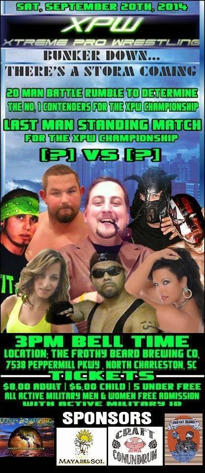
Last and definitely least, I give you the poster that recently set a few threads on Facebook afire. 


To begin, the reason for it having caused such a stir is the fact that TNA/Impact Wrestling star Gunner was vocal on social media that he would not be at this show and that his likeness was being used to promote the event despite his having no involvement. He was never booked for this event but you wouldn't know that by the look of the poster. (Nikita Koloff, from what I've read, did appear as advertised.)

This doesn't happen that frequently anymore but it does happen. Scumbag promoters will do things like this in order to sell tickets then their excuse to a disappointed fan will be the "card subject to change" clause that seems to accompany ever wrestling event by default. (Or as was done by one local promoter a few years ago who advertised Samoa Joe as being on one of his events, you could claim the star no-showed [even going so far as to arrive late to your own venue, with the story being that you were at the airport waiting for "The Samoan Submission Machine" to arrive] only to have it revealed later that you never paid his appearance fee or booked his travel.) That phrase used to be in place because there were times where talent had travel issues or injuries and couldn't make it - in this situation it's there because the jerk running the show knew he wasn't going to draw a crowd unless he could get the people to believe there were known wrestlers on the card. It's pathetic and people like this should be run put of business; sadly enough, they're usually the ones who manage to hang around the longest.

One of the other talents shown on this particular poster is a guy who calls himself Rex Rumble. I mentioned in a previous paragraph how one of the posters featured talent that didn't quite look like anyone that would be worth paying to see. (Get a membership to a gym and a tanning salon, for crying out loud - maybe go to "GNC" and get some "supplements", if you know what I'm saying?) Notice that the image on the poster of Rex makes him appear to be a tough guy, as he has his fists clinched, ready to fight. If you squint real hard, you might even say he could pass for someone whose look was inspired by Kevin Nash.

Here's a more, shall we say, honest picture of him.


Yeah, people who live in glass houses shouldn't throw stones and I'm certainly not the one to be criticizing people about their physiques, but I'm also not squeezing my voluptuous beer gut into an Under Armour-style shirt and wrapping my arms in electrical tape up to my elbows so I can go play fight with my buddies.

Beyond that, I'll say that this poster looks more like a page out of a high school football program than anything. (That or one of those athletics schedule posters you find at gas stations. You know the type - the schedule gets about 2 inches of space and the rest of the poster is nothing but ads.) Sponsors are great but you can't put that many corporate logos on a poster. It detracts from the purpose of the thing, which is to promote the event. Give those businesses an opportunity to hang banners at the venue, sure, but don't saturate a poster with that nonsense.

I've written this entry with a tongue in cheek approach, and I hope that's detectable. I'm reaching a point in my life where even though I love wrestling I'm beyond being able to take any of it seriously. No matter how much people like myself would appreciate it, Ric Flair and Ricky Steamboat can't go for 60 minutes anymore. Arn & Ole Anderson aren't going to come to a ring and make you believe that they're capable of crippling their opponents. Bret Hart isn't going to be having any more 5-star bouts with the likes of Mr. Perfect or Steve Austin. As much as it pains me, I've accepted these things. Similarly, I've accepted that there's no better way to handle the goofball side of pro wrestling than by treating it as such. If Mystery Science Theater 3000 taught me anything, it's that there's fun to be had in pointing out the ridiculousness of what some people would call art, so that's exactly what I'll continue to do - have fun and make the best of what's left of indie pro wrestling in the Carolinas.