
We start off this entry with a real beauty from OMEGA Championship Wrestling which was used to promote their recent LOCO IN JOCO 2 event. Something I don't feel as though I've touched on in talking about exemplary posters in the past is the concept of form or how the layout of a poster makes the eye flow from one aspect of it to another. In the case of this poster, the LOCO IN JOCO logo (Say that 10 times fast!) creates a natural center point and the talent form a ring around it. Because of this, your eye naturally floats around the perimeter and you get to appreciate the quality each stock photo of the talent appearing on the show.
I was not at this event put I've seen photos and video from it and it was a literal standing-room-only affair. I have no doubt that these posters being seen in the local area played at least a part in that success!

Premiere Wrestling Xperience is consistently at the top of each of these entries, and there's a reason for that. I don't know if they have a dedicated art department or what but their posters are indicative of their having someone behind the scenes who's remarkably talented. This poster represents their DAWN OF A NEW DAY event. The only possible criticism I could make for this poster, and it would be reaching for something just to rake them over the coals about, is that they possibly could have incorporated a background that played into the idea of the "dawn" aspect of the event title. Like I said, that's me nitpicking for the sake of nitpicking - it's a fantastic poster regardless.

Flatline Pro Wrestling is an up & coming promotion operating not far from Augusta, Georgia that has gotten a lot of attention here lately and for all the right reasons. Their shows feature young, athletic, entertaining talent and their promoter seems to be doing a fine job of using every mechanism possible to get the word out about their events, which is a recipe for success. (Truly, it's amazing what can happen when wrestlers wrestle and promoters promote - people say the business is down, I say it's only down for promoters who aren't working hard enough.) There's a lot going on in this poster, which was used to advertise their REDEMPTION event, and it's a bit text-heavy but I have to say that I love what they're doing.
The talent stock photos are fantastic - clearly someone there gets what I've been saying about having crisp, clear images of the roster available for use in promotional materials. In this regard, I want to point out the center of the poster where two matches are detailed because this area is my favorite aspect of the whole thing. If you look there, what does it remind you of? From my perspective, it looks just like the versus loading screens from older fighting video games like Mortal Kombat and Street Fighter! I dig that and while I know they aren't the first to borrow the idea I think they've done it well enough to warrant taking note of it.

I don't recall that I've ever previously featured a poster from Shockwave Wrestling Entertainment in this series. They are one of several promotions (including Ring Wars Carolina and Steve Corino's Premiere Wrestling Federation) that seem to have popped up here lately in eastern North Carolina. North Carolina has never been lacking when it comes to professional wrestling, needless to say, but quantity doesn't necessarily equate with quality. That said, I feel as though this poster doesn't exactly deliver any incentives in the "I'm a wrestling fan but I've never seen these guys before" department. What I mean by that is, with the exception of Steve Corino, if I see this combination of talent on a poster I can't say that I'm going to become interested in attending the event. I see a lot of guys wearing shirts and two women who wouldn't make me turn my head if I saw them walking around in public. Harsh as though that may sound, this is a business where looks and physique matter almost more than anything else. The washed out, "antiqued" look doesn't help matters as it makes me feel as though it's there to try and hide flaws as opposed to compliment anything. As an admitted hard-to-please fan of professional wrestling, if all I ever see of SWE is this poster, unfortunately I won't have been convinced that the show is worth checking out.

I can't help but feel as though Southern Wrestling Association out of Forest City, North Carolina gets poorly represented by their posters. I genuinely hate to say that because I see photos and video from their events all the time, and hardly ever do I come away from absorbing that content feeling as though their shows aren't worthwhile. Quite the opposite, honestly - if not for the fact that it would be a 3+ hour drive for me, I'd probably attend their events. Be that as it may, this poster is what it is, which is to say more of the same from their "art department". I have no idea why you would select a photo of paint flaking off some random surface as a background image. Why? It doesn't make your product edgy, if that's what you're going for. The stock photos seem like whoever made this is doing the best they can with what they've got to work with, which is admirable in terms of effort but fruitless here because of the overall composition.

Here we have a poster from another North Carolina-based promotion, AIWF Mid Atlantic, even though you wouldn't know it from looking at this poster. Yes, the Allied Independent Wrestling Federations logo is present, but AIWF is the sanctioning body, not the name of the promotion. This is a fine example of a poster where the text on said poster overwhelms the featured talent. That's a bad thing because, as I've said before, a professional wrestling event poster isn't supposed to sell text, it's supposed to sell the wrestlers involved. Speaking of the talent involved, there are a lot of them pictured here - so many, in fact, that I think between them and the massive amount of text this may qualify as one of the most unnecessarily busy posters I've ever seen. On the plus side, the stock photos are of good quality, and there's a piggy bank piñata. (Because, lucha libre?)

Before I get into the next poster, I want to talk about something related to the AIWF. It is my understanding that the term "independent professional wrestling" was originally a descriptor for any promotion not operating under the umbrella of the National Wrestling Alliance. In other words, if you were indie then you weren't with NWA, and if you were with NWA then you weren't indie. Obviously this is a very old term, one that pre-dates the existence of World Wrestling Entertainment. Consider that definition and apply it to AIWF, which is essentially a take on the NWA model. How can you be independent if you're part of an alliance? Likewise, if you're part of an alliance then how can you be independent? It's semantics and it very much reminds me of this scene from the Brendan Fraser classic, Airheads (skip to about the 1:50 mark).
From the "we use images of wrestlers from 20 years ago because current images would scare people away" department comes this gem from the North Carolina Wrestling Association. And no, I'm not talking about Sonjay Dutt - that's a mostly current photo of him as he's arguably in better shape now than he ever has been before. I'm talking about Justin Credible, Jim Neidhart, Ricky Morton, and Buff Bagwell. None of those guys look like that anymore, especially not Morton. (To his credit, Justin Credible had fallen on hard times but does appear to be getting back into form.) Also, who knew Sonny Onoo was still taking bookings? Here I thought he'd retired and moved back to Japan so he could run one of those fancy dance clubs where all the guys are street racers or Yakuza and all the girls are way too young to be in such an establishment.

Professional wrestling isn't an industry that has much in the way of a moral center, but I'm going to get on my moral high horse here for a moment because the poster below from the Alabama Wrestling Federation is a disgusting example of what some people will do in an attempt to draw a crowd.
For years, Matt Osborne performed in WWE rings as Doink the Clown. He would go on to continue performing as Doink on the independent circuit after he was released from the company, however the nature of the costume and gimmick allowed for many people to rip off the character. On any given night you could see "Doink" appearing in Charlotte and Dallas, or Phoenix and Columbia, or Orlando and Brooklyn because there were dozens of copycats.
Sadly, Matt Osborne died in 2013 of a drug overdose. Because there is seemingly no honor among certain people within professional wrestling, here you have a promotion advertising an appearance by Doink the Clown.
I would not go to an event promoted by a company that does this sort of thing on principle alone. They should be ashamed, and so should anyone who works for them.

Moving on from that wretched stupidity, here we have our first ever exhibit from Action Packed Wrestling in Chester, South Carolina. (Not to be confused with American Pro Wrestling just up the road from Chester in Boiling Springs, SC.) I have to tread somewhat lightly here because I used to attend APW events. Their building wasn't far from Lancaster, SC which is my hometown and where I lived for the majority of my life. APW has the distinction of having had quite a bit of very good talent coming through their doors - for example, before he was Gunner in Total Non-stop Action/Impact Wrestling he was known as Phil Shatter and he was a mainstay for APW.

That having been said, I've joked that some of these posters could've been made in Microsoft Paint but I think this one actually was. If not Paint certainly some other rudimentary graphics application where that kind of firey, glowing border/outline thingy they've done there is considered a "high-end" effect. I think if I handed a 6 year old a box of markers, a pack of construction paper, some stock photos of those wrestlers, a pair of scissors, and a glue stick they could've come up with something more respectable than this.

In the wake of Extreme Championship Wrestling's demise there were several other companies that would go on to make use of many members from ECW's roster in an attempt at recreating the same kind of frenzied, chaotic, and oddly entertaining content ECW had been able to generate. One of those was Xtreme Pro Wrestling from Los Angeles, California. XPW never really stabilized itself (for a variety of reasons, main among them being the fact that their owner, Rob Zicari - a pornographer who runs a company known as Extreme Associates - was indicted for distributing obscene pornographic material), but the fact of the matter is that they were an established company that, technically, still exists.
That said, the poster below is not for Xtreme Pro Wrestling - well, at least not that Xtreme Pro Wrestling. This is the Xtreme Pro Wrestling that is based somewhere in the coastal region of South Carolina and has shows at a brewery in North Charleston.
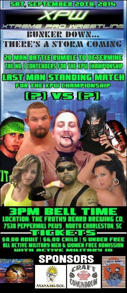
Seriously, guys - I know it's not easy to come up with a unique name for a promotion these days but at least try to be original! And for that matter, if you're not sure someone else might be using the name you have settled on, there's this handy website called Google that will help you find pretty much anything ever recorded in the history of mankind, so you might want to look and see if it's already been copyrighted by someone else before you do anything silly like having t-shirts made.
Speaking of promotions with poorly chosen names, here we have a poster produced by Dirty South Championship Wrestling emanating from Supply, NC. I gather that DSCW is in something of a feud with Myrtle Beach's C4W Explosive Wrestling, which (perhaps not surprisingly) is a federation I've featured here in this blog series in the past. This poster is like Frankenstein's monster in that it's a whole bunch of pieces that don't necessarily belong together assembled into the final product. The shoddy stock photos, layout, and graphics aside, I'd like to point out that they've made egregious use of a copyrighted logo, that being of the Versus TV network (which doesn't actually exist anymore as it was converted into the NBC Sports network some time ago).

Reusing clip art or graphics is one thing but ripping off something like a corporate symbol is something else entirely.

Pop quiz, folks - what's the color of key lime pie filling and loaded with 7 examples of bad talent stock photos? This poster from New Millennium Championship Wrestling!
This is another poster I hate to drag through the mud because it was apparently meant to promote a fundraiser event. Be that as it may, I can't help but throw a few jabs at the gimmicks featured herein. "Ravishing" Shane Austin - nothing says "ravishing" like prison tattoos and cheap sunglasses on a guy with a double chin. "Dreamz" - watching him wrestle will put you in a coma, it seems to say. Chris "Thunder" Anderson - because claiming to be an Anderson is never a bad idea if you're a wrestler who's a heavyset guy with a beard. "Delta Squad" - that's the one Chuck Norris was in, right? (Nope, sorry, that was Delta Force.) "Tank Sherman" - instead of a Sherman tank, get it? (See what we did there?) "Ringlord Speedy" - what the Hell is that about?

Earlier in this entry I brought you a poster from Action Packed Wrestling, which is one of two APWs operating in South Carolina. Up next is a poster from the other APW, American Pro Wrestling in Spartanburg, SC, where there's apparently "A NEW SHERIFF IN TOWN".

That, friends, is nothing short of gimmick infringement. I just wonder if he got the Brahma bull tattoo (which, of course, has been made famous by "The Rock" Dwayne Johnson) before or after he decided to become a professional wrestler.
Conveniently enough, the last poster I'll give you in this submission is from Last Rites Wrestling out of Franklin, NC where they apparently prefer their posters the color of sweet potatoes instead of key lime pie filling. Also, what did people use to dry their CLOTHES before the advent of CLOTHES dryers?
CLOSELINES, that's what...

No comments:
Post a Comment